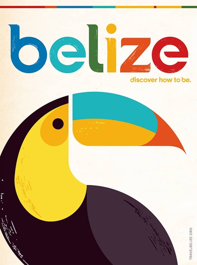
After 26 years, the Belize Tourism Board (BTB) gets a new logo.
I set out to find out what everyone thought of the change and the results were interesting. Many are excited for the change, while others criticize it dearly.
Let’s start off with the core positives: the yays!
1. The colors are vibrant and true to the Caribbean.
Belize is certainly multi-colored. Both Candice and Lindsey mentioned they love the bright colors and I completely agree with them. If you take a stroll around Caye Caulker or Placencia you’ll unquestionably run into a wide assortment of vivid shades – if it isn’t the colorful houses, picket fences and road signs; it’s the beautiful natural environment.
2. The retro look is awesome.
Brendan said he loves old school posters and Belize’s travel poster looks clean and crisp. This is true, vintage posters are loved by travel enthusiasts and this new promotion will strike a chord with fellow travelers. Kudos to the BTB in going with a classic vibe which definitely takes advantage of this trend. If you want to take a look at a great collection of vintage travel posters, check out Michael’s top picks.
Now for the main negatives: the nays!
1. It’s too unoriginal. Aside from it been done before, if you take a look at many other destinations’ logos, you can say it’s actually being done too much.
One country that has perfectly implemented bold colorful text into their logo is Guatemala. However, what really completes their logo is how they include all the major aspects that make Guatemala a great travel destination – the Maya temples, Volcanoes and Lakes. If Belize was following the bold and colorful text path, shouldn’t they have at least included things that make travel to Belize unique?
1. The retro look is cool but it is a miss. It unfortunately looks dated in a bad way.
Ayngelina goes on to say that vintage posters work well for destinations that people are very familiar with, such as London, Paris, and Rome. The issue with Belize is that most people don’t know much about it and as a result, showing a vintage poster with a bird doesn’t inspire people to visit Belize over any other country. And after seeing other vintage travel posters, I am forced to look at Belize’s one and say… “meh, it really isn’t too impressive.” It doesn’t pop like others I’ve come across.
My conclusion
It’s OK but I’m not totally sold on it.
To quote one of my readers, “the beauty of Belize and all its diverseness can’t be captured simply with the toucan.”
I personally love toucans, but the issue is that there needs to be a bigger push to showcase Belize’s culture and nature. So dear BTB, get back to the drawing board and take a hint from the video that Belikin Beer produced – there’s a reason why it went viral.
P.s. I’m certain I won’t miss the slogan: “Mother Nature’s Best Kept Secret.” What are your thoughts about Belize’s new logo?


Nice bird, but the font makes me think of the Philippines. Clean, but not original. Feel lacking.
The Belize logo has been chosen as a finalist for the “One Show Design” 2013 awards, in the category of “Brand Identity – Logo Design.” The Belize Tourism Board and its Advertising and Online Agency, Olson, created the Belize logo as a part of a re-branding of Belize’s identity.
It’s a bit on the plain side, but that’s what a logo ought to be anyway–add too many details, and they get lost. I like how simple it is, and it’s appropriate to include the toucan, as it’s the national bird of Belize and easily recognizable. Truth be told, I’m not sure how many foreigners would even recognize an image of the Mayan ruins–most don’t even know where Belize is located. Still, valid assessment 🙂
Thanks for your input! It’s appreciated!
Some more info about it here, plus a video telling more about it. http://creativity-online.com/work/belizean-tourist-board-behind-the-new-logo/30379
Some more info about it here, plus a pretty cool video. http://creativity-online.com/work/belizean-tourist-board-behind-the-new-logo/30379
I’m not sold on it, either. And the tag line definitely lets them fill in the blank (as in “Discover how to be WHAT?”), but I don’t really like it.
Discover to be what ever you want..let me break it down to you..means discover how be in love..discover how be mesmerize..discover how to be quench etc..when you visit belize..you can discover how to be..when the commercial comes out then i believe you and everybody else will understand..until then discover how to undertand and relax..
Woa! (as I rummage through my ancient files…) I truly hafta laugh. “26 years” you say? Shoot, back when I first started running trips to Belize (in ’85) there WAS no BTB (nor guidebook, nor a single “You’d Better Belize It!” t-shirt) Indeed, few had even HEARD of the tiny nation of Belize (I’d have to say “used to be British Honduras”), not to mention the little civil war going on back then in nearby Nicaragua (indeed, in those days “Central America” was synonymous with “contras” on the 6pm news).
But what’s truly amazing – that new toucan logo is nearly IDENTICAL to my “Imagine Belize” logo back in those ancient times. Too bad all my old brochures are tucked in the dark corners of my 5′ x 6′ storage locker in Seattle – as I now live here in Vietnam.
That’s interesting. Would love to see your logo 🙂
Yep, wish that I had a copy. But bear in mind that in those days, we didn’t have digital, so the only things I have left are a few stray paper brochures I saved from those early days of my tour biz. And even those, are buried in the dark (and by now damp) of my storage locker in Seattle.
Personally, I like the new BTB logo – especially the colors. I think it aptly connotes the playful “No problem, Mon” spirit of Belize. Not sure how you’d otherwise incorporate all the many faces of the tiny nation into a single logo. Logos are completely different than a 1.5 minute video – they’re meant to SYMBOLIZE in the simplest way possible – so as to to be easily memorable. Think: Nike. 😉
The colors are great on the new logo!
Thanks for commenting Micheal!
Nice work on the article. As to what belikin beer said nice line as well but the difference is that belikin did a commercial and not a logo make over. You missed the point. You are comparing apples to bananas. When BTB put out its commercial then you can compare and tell BTB go back to the drawing board..
Note that I mention that they need to make a bigger push towards showcasing Belize’s culture and nature. That’s my comparison to Belikin’s commercial. Take a look at Guatemala’s logo for instance, it features their heritage and natural environment.
Well i believe that bigger push towards showcasing belize will be in btb commercial..i have seen a glimpse of it and from what i saw it’s pretty awesome..
I would love to see it when it’s completed. Thanks for commenting,
Nice balanced article. Also.. cheers for your last line ;), we appreciate it.
Thanks!
That’s a very awesome logo I need to admit. So colorful and shaped nicely ;-). “Like” from me.
Yeah, I love the colors!